
Wednesday, July 27, 2011


Sunday, July 24, 2011


Serial Cut
http://www.serialcut.com/

This artist really makes his work the focus of his website. Floating navigation over the top of his work, and allowing his whole page to be used as a canvas to display his work is very effective, and allows you to really appreciate his work. He also includes a display all function, and separates all his work into categories on that page. The web portfolio is very fresh, but it also maintains usability and avoids being confusing, or too flashy.
Jason Reed
http://www.jasonreedwebdesign.com/


I really like how he uses the type to emphasize his name, what he does, and key information like places he's worked, and links to his contact info. I also think by using a self portrait, it puts a face to the name as well as displaying more of his work. I like the use of spot color, and the organization of his content.
Sunday, July 10, 2011
John Likens
http://johnlikens.com/index.html

I like this portfolio a lot because everything is big, simple, and straight forward. The previews of his work are all very eye catching, and cause you to want to see more of the work. The simplicity holds everything together so well, and following the same format for each page is very helpful and keeps everything tied together.

I like this portfolio a lot because everything is big, simple, and straight forward. The previews of his work are all very eye catching, and cause you to want to see more of the work. The simplicity holds everything together so well, and following the same format for each page is very helpful and keeps everything tied together.
Alexarts
http://alexarts.ru/en/index.html
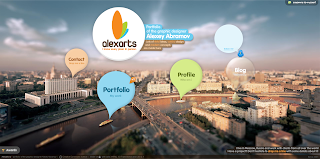
This portfolio is very fresh, and unique. The interface makes it stand out among other portfolios, and its very successful. The graphic design is beautiful, and leaves a lasting impression. This portfolio along with others really shines as a project within itself.

This portfolio is very fresh, and unique. The interface makes it stand out among other portfolios, and its very successful. The graphic design is beautiful, and leaves a lasting impression. This portfolio along with others really shines as a project within itself.
Kevin Lucius
http://www.kevinlucius.com/

This is another great example of a one page portfolio. Everything is easy to find, and is organized in a way that is similar to what you would find used on a portfolio or business card. His portfolio is very personal, and the use of different textures makes everything enjoyable to look at, and without clicking on a thumbnail, it gives you a feel for what the designers work is like.

This is another great example of a one page portfolio. Everything is easy to find, and is organized in a way that is similar to what you would find used on a portfolio or business card. His portfolio is very personal, and the use of different textures makes everything enjoyable to look at, and without clicking on a thumbnail, it gives you a feel for what the designers work is like.
Tuesday, July 5, 2011
Gregory Alan Althoff
http://greg.cleanandcreative.com/8908/selected-works


I like the use of background textures in this portfolio, as well as the logo he has designed for himself. I like how everything is separated into different sections by using horizontal rules, as well as color differentiation.
Justin M. Maller
http://www.justinmaller.com/showcase.html

I like that the header stays over the top of the website, and you never have to scroll back to the top to find the navigation. I also like that his work is the focus of his portfolio. The preview pictures give enough information to summarize the work, and it's displayed very well.
Subscribe to:
Posts (Atom)