I really like the cleverness of this portfolio. The url, as well as the identity of the graphic design firm is really creative, and causes you to remember them. I like the compactness of the design, and the use of javascript to organize everything.
I really like that this portfolio is horizontal as opposed to vertical. I like the navigation in the top corner, and that his work is separated into the two categories offline and online. The only thing I would change about the portfolio would be to put links to the live version of his online work, and maybe include some sort of description for each work.
I really like the layout of this portfolio. It is really creative, and with everything on one page, seperated into three parts, you only have to load the one page and scroll up and down (or use the provided navigation). I like that the design of the site itself keeps you interesed and is fun to look at while still serving its purpose and not being distracting.
Yet another simplistic blog. I really like that the header floats over the content and makes finding information very easy. I enjoy his use of typography as a main element, and that everything is all on one page. Linking to his resume is a nice touch, and using a grid to organize his work as well as linking to larger pictures and live versions of his web work is important. This portfolio demonstrates that simplicity can be very effective, and is an example of great design.
I really like the layout of this portfolio. It is very clean and professional looking. I like that the first thing on the page is a picture of the designer, and a bio as well as contact information. One thing I would have liked better would be for the designer's name to stand out a bit more instead of having to search for it.
I think the layout of the website works well, however i feel it would benefit from either links that seperate the work, as well as a link to the work, or a larger version of the work. The text is all every easy to read, and the organization is done very well.
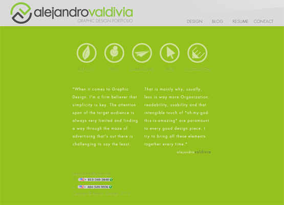
I really like the layout of Alejandro's portfolio. I'm a sucker for icons and a lover of simplicity, so those are the first things that stand out to me. I also like the choice of color for the head banner, but I think there is an issue of legibility in the actual body of the website. I really enjoy the icons being a prominent element of the opening page, but the green background kind of gives me a head ache, and I prefer the layout he has used for showing his work over the main page. The links in the footer blend into the background, and its hard to read them. Overall, I really like the simplicity and cleanness of the design as well as the logo used for the header.